Twenty-six live experiments with our own mark, photography, and footage. Move your cursor into each panel and play. Everything here is hand-built code, no plugins, no subscriptions, and every one of these could be running on your brand next week.
Here is the uncomfortable truth about websites: your visitor has seen ten thousand of them. Their eyes slide over stock layouts the way yours slide over billboards on a familiar drive. The brain is a prediction machine, and anything it can predict, it ignores.
That is why motion matters. Not decoration, not things spinning for the sake of spinning, but moments the visitor causes. When a page responds to your hand, your brain files it as an object, not a document. People forget what they read. They remember what they touched. That memory is the whole game: it is the difference between "some web company" and "the site with the pyramid that watched me."
Our rule for all of it: calm by default, alive on touch. Nothing below moves until you ask it to. Restraint is what makes the response land.

A band of light crosses the mark as your cursor passes, the way light rakes across brushed metal when you walk by. Your eye is wired to notice specular light moving over a surface, it is how you tell glass from paper at a glance.
Why it earns attention: it whispers. The material suddenly feels physical and expensive, and the visitor is not sure the site did anything at all. Perfect for luxury brands and logos that should feel machined, not printed.


The mark floats like a physical plate and leans toward your cursor in true perspective, glare sliding across its face, shadow deepening underneath as it banks. Collectors know this one: it is the holographic trading card, rebuilt for a brand.
Why it earns attention: depth is a promise of craft. The instant something obeys perspective, the brain grants it object status, and objects get picked up, turned over, and remembered. This is the safest crowd-pleaser in the lab.


Three layers, one mark: a glowing aura that swings wide, the mark itself moving less, and a spark of light gliding against the grain. Your cursor separates the layers and the logo gains real depth, like a projection hanging in the panel.
Why it earns attention: parallax is how your eyes measure distance in the physical world. Fake it well and a flat PNG reads as volume. It is sci-fi without a render farm, and it makes "just a logo" feel like an artifact.

The pyramid holds perfectly still. But the light at its core follows you, glowing through the flame cutout, always oriented toward your cursor. Wherever you go on the panel, the mark is quietly looking back.
Why it earns attention: nothing on earth grabs a human faster than being looked at. Eye contact triggers ancient circuitry, and a brand that "sees" its visitor makes our whole promise physical: we see what others miss. The motion is almost nothing. The effect is the most memorable on this page.
Not a picture of a pyramid, an actual one: four translucent glass faces standing in real 3D space, turning as your cursor crosses the panel. Light passes through it, faces occlude each other, geometry does the work.
Why it earns attention: genuine dimensionality on the web is still rare enough to stop a scroll. The tradeoff is honesty: this is a geometric cousin of the mark rather than the mark itself, so it works best as a scene object, not a logo replacement.
The mark arrives in pieces. Six shards fly in from the edges, tumbling, and lock into the pyramid as the panel enters your view. One second of theater, then stillness.
Why it earns attention: completion is deeply satisfying to watch, the brain leans in to see fragments resolve into a whole. It also tells a story in one gesture: we take scattered pieces and build something sharp. Scroll-driven, so the visitor conducts it.

Rest on the mark and it loses solidity, edges swimming like heat haze off summer asphalt, then it snaps back the moment you leave. The logo becomes briefly molten, something between glass and smoke.
Why it earns attention: it violates material expectations. Solid things should not ripple, and small violations of physics are exactly what the brain flags for a second look. The most occult mood in the lab; tuned wrong it turns gimmick, tuned right it is hypnotic.

The mark sits at the center of its own small solar system: five glowing shards on slow elliptical paths around it. Bring your cursor close and they scatter from your hand before easing back into their lanes.
Why it earns attention: ambient life at the edge of perception. The system says the brand has gravity, things orbit it. Because the shards are small and slow, it stays restful, the same physics as the drifting photo collage on our homepage.
Your cursor becomes a brush. Sweep across the panel and Quad Cities photography blooms along your path, each frame tumbling in, holding a beat, and dissolving. Stop moving and the canvas clears itself.
Why it earns attention: it turns idle mousing into play, and play holds people on a page far longer than reading does. For a studio, it is also a quiet flex: a brand with this much imagery can afford to spend it on a moment of delight.
Inside this panel, scrolling does not move a page, it scrubs a film. The mark assembles from its foundation upward, frame by frame, at exactly the speed you choose. Scroll back and it deconstructs. You are not watching the story, you are conducting it.
Why it earns attention: this is the technique Apple uses to launch thousand-dollar products, and it works because agency beats spectacle: what you control, you remember. On our site this becomes the services section, the pyramid building a layer per service as you pass.

Inside this panel your pointer is ours: a teal dot with a trailing ring that knows what it is over. Cross the photo and it becomes a View badge. Near the button, the button leans in to meet you. Over the rail, it says Drag before you have to wonder.
Why it earns attention: the cursor is the one element on screen one hundred percent of the time, and almost nobody designs it. Claiming it makes the whole site feel inhabited, and the labels quietly remove hesitation, which is conversion work disguised as delight.
Two bands of type drift past each other at a crawl, until you scroll. The harder you throw the page, the faster they run and the further they lean, skewing like they are braking against your momentum, then settling back to a glide.
Why it earns attention: it gives the page mass. When type physically reacts to how you handle the site, scrolling stops being navigation and starts being contact. Award sites use this as connective tissue between sections.
These buttons want to be pressed. Drift within range and they lean toward your cursor, growing slightly, like iron filings sensing the field. Leave, and they spring back to rest.
Why it earns attention: it flips the power dynamic of a click. The interface reaching toward the visitor reads as eagerness, and eagerness is persuasive. Applied to every CTA on a site, it measurably pulls more presses.
WE SEE WHAT
OTHERS MISS.
The headline does not appear, it computes. Characters churn through cipher glyphs and lock into place one by one, left to right, like the sentence is being decrypted in front of you.
Why it earns attention: unresolved text is a puzzle, and the brain cannot look away from a puzzle that is actively solving itself. For a company selling AI, copy that decodes into meaning is the brand promise performed by the typography.
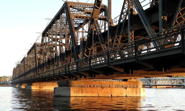
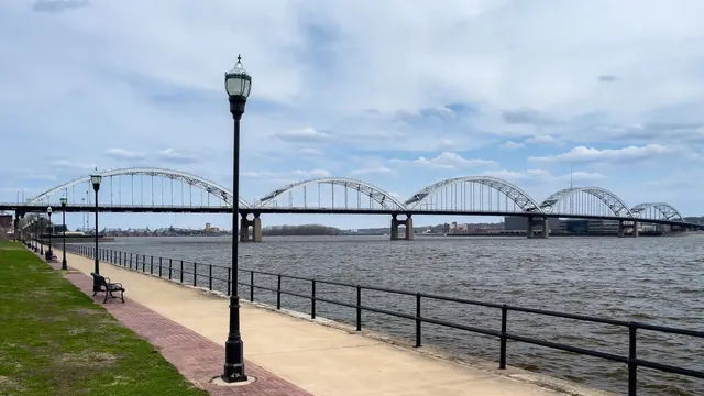
This is your Centennial Bridge photo behind actual shader code. Your cursor sends rings through the image like a fingertip on still water, light bending, colors fringing at the wavefront, and the surface settles when you leave.
Why it earns attention: this is the current gold standard of "expensive site." Real-time distortion runs on the GPU, which is why page builders cannot fake it. On portfolio thumbnails it makes every hover feel like touching the work itself.
A dozen shards of the brand lie in a pile with real gravity. Pick one up, throw it, watch it arc, bounce, tumble off the others, and come to rest somewhere new. No two visitors leave the pile the same.
Why it earns attention: pure toy value. People will sit in a footer for a full minute throwing shards around, and every second of play is brand time no paragraph could buy. It says the studio has enough craft left over to be playful with it.
This panel just checked the actual weather in the Quad Cities. If it is raining downtown, it rains here. Snowing, it snows. The wind you see is today's wind speed. Try the override chips to preview other skies.
Why it earns attention: a site that knows what is outside your visitor's window collapses the distance between screen and street. Nobody expects a website to be weather-aware, and "we see what others miss" becomes something the page literally does.
The letters are windows. Jake's own dusk footage of the I-74 bridge plays inside the words themselves, the river moving through the typography. The video only loads when you arrive here, so the page pays nothing for it until you look.
Why it earns attention: type you read, footage you feel. Fusing them makes a headline cinematic without a single pixel of layout spent on a video player.
One swarm of particles, three identities. The dots assemble into the mark, burst apart, and reassemble as the words, then as the Centennial's arches, cycling on their own or on your tap. The particles never die, they just change their minds.
Why it earns attention: transformation is the strongest visual verb there is. A logo that becomes a sentence that becomes a bridge tells your whole story without a paragraph.


The portfolio as a place instead of a list. Grab the field and wander through the work scattered across it, with momentum and soft edges. There is no order and no bottom, just territory.
Why it earns attention: exploration beats pagination. When visitors steer, they hunt, and hunting is engagement no scroll depth metric can match.


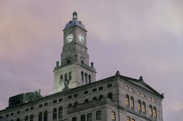
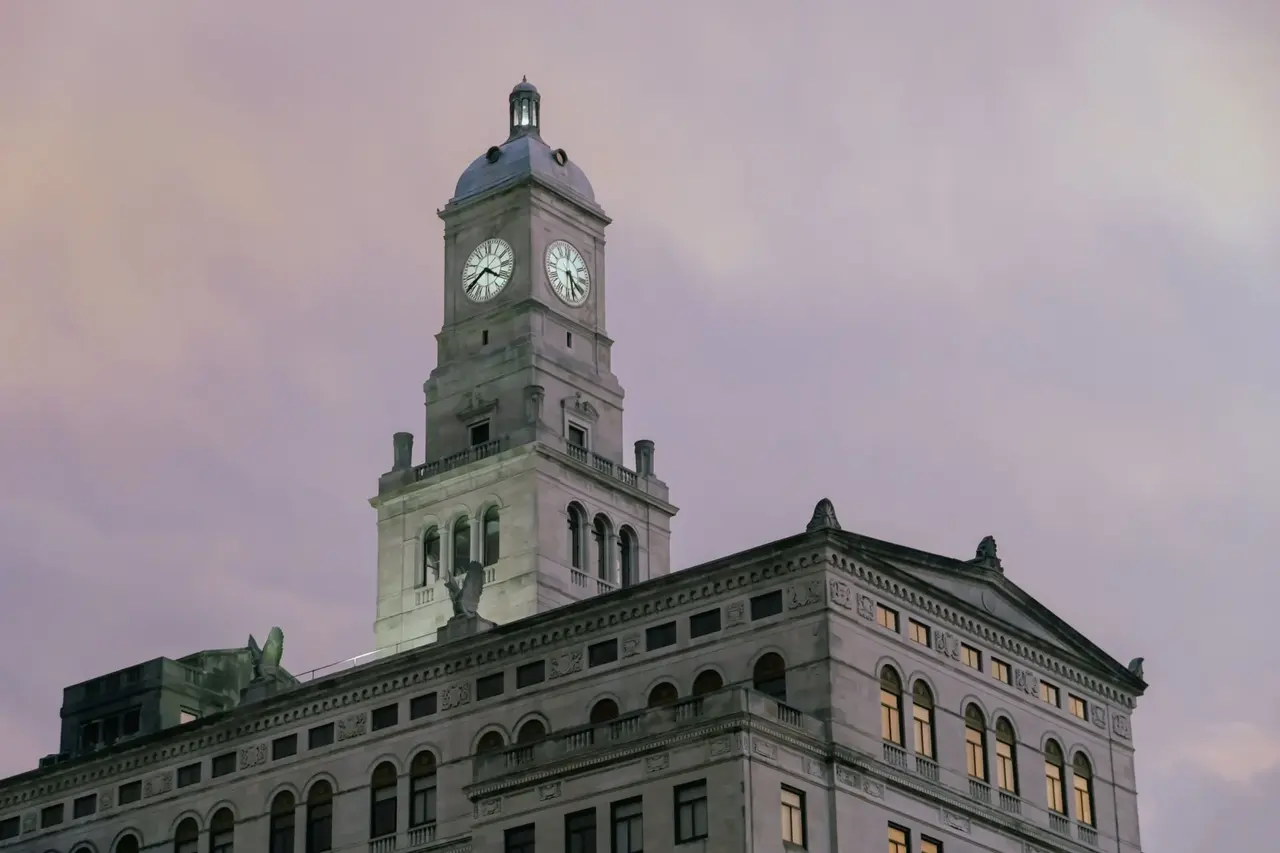
Scrolling here does not move past the photo, it moves INTO it. You plunge toward the clock tower until the image gives way and you surface inside the next scene. Scroll back up to climb back out.
Why it earns attention: it turns transitions into travel. Sections stop being stacked paper and become nested worlds, and the visitor's own scroll is the camera.

The Centennial draws itself: glowing strokes trace the arches like a hand sketching in light, and when the linework completes, the photograph develops beneath it.
Why it earns attention: process is mesmerizing. Watching something get made, even for two seconds, creates more investment than seeing it finished ever could.
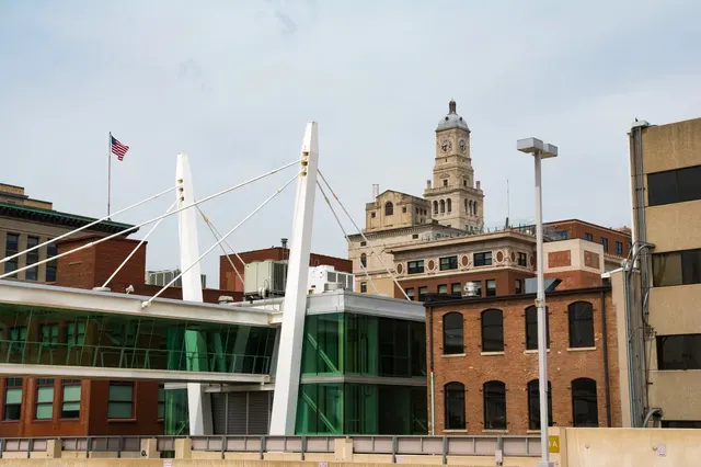
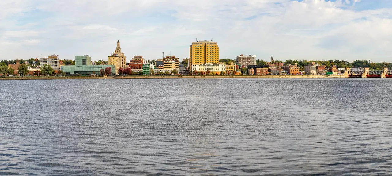
DAVENPORT, FROM THE ILLINOIS SIDEVertical scroll, horizontal travel. As you scroll inside the panel, the full Davenport riverfront slides past like a train window, your thumb moves down, the city moves across.
Why it earns attention: the axis-flip is quietly disorienting in the best way, and it is the only honest home for a panorama: wide photography finally gets to be wide.

Photographs should not stretch. This one does. Grab it, pull, and it elongates like gelatin, release and it wobbles back into shape, oscillating until it settles.
Why it earns attention: materials with the wrong physics demand a second touch. Nobody stretches it once.
Your numbers arrive like trains being announced: every character clatters through the alphabet on its own flap before locking in, the old airport board rebuilt in pixels.
Why it earns attention: mechanical nostalgia plus anticipation. The eye cannot leave a board mid-flip, which makes it the highest-attention way to state a statistic.
This panel is the sky over the Quad Cities right now: the sun or moon sits where it actually is between today's real sunrise and sunset, and the colors track the hour. Imagine the whole site doing this, defaulting to dark the moment the sun drops over the Mississippi.
Why it earns attention: a site that lives on local time feels less like a document and more like a neighbor. It is ambient proof that "local" is not just a word in the footer.
None of these effects exist in a page builder. That is the point. Template sites can only recombine what everyone already has, which is why every plumber, dentist, and boutique in a hundred miles looks vaguely identical. A bespoke moment, even one, breaks the pattern, and pattern breaks are what attention is made of.
The old economics said custom interaction was agency-money. Ours do not: we build with AI leverage, so a moment like the Watching Eye costs us an afternoon, not a sprint. That is how a $1,000 site from us can carry a detail that a $20,000 site from elsewhere would not bother with. Your customers will not know why your site feels different. They will just remember it, and remembering is the sale.
Put a moment like this on your site